

From ‘Father Knows Best’ to ‘Final Destination’: How Legacy Sequels Took Over the World
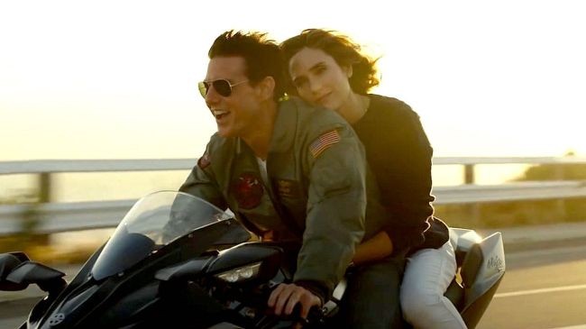

Definitions first: a legacy sequel (aka legacyquel) is made when a meaningful amount of time has elapsed from the last installment, beginning almost afresh rather than being produced as another installment prolonging a profitable franchise. At least some of the original cast members must be involved, and their conspicuously aged appearance will inevitably be poignant — an optional but generally baked-in emotional component.
The first legacy sequels came from TV, and a little digging suggests that the first American feature-length instance could be “Father Knows Best Reunion” in 1977, followed that winter by “Father Knows Best: Home for Christmas,” 17 years after a series which began on radio in 1949 ended its TV run in 1960. The first big-screen legacy sequels also grew out of TV. In 1979, “Star Trek: the Motion Picture” jump-starteda feature-film second act for the crew, culminating 15 years later in a feature-film handoff from Captain Kirk to Picard in 1994’s straightforwardly-titled “Star Trek: Generations,” which killed off the original show’s captain for extra-bathetic measure.


But the legacy sequel as near-inevitability didn’t really take off in earnest until the 2000s, when millennial nostalgia started contracting in quicker cycles. 2011’s “Scream 4” reunited the unkillable core cast a decade-plus after the last film for lots of jokes about hating younger people; the villain is social media-fixated, while previously goofy characters like David Arquette’s Dewey Riley have acquired unexpected gravitas simply by surviving and aging with quasi-dignity.
More recently, “Top Gun: Maverick” and “Final Destination: Bloodlines” leaned upon the pathos of visibly ill actors playing old favorites (Val Kilmer and Tony Todd, respectively) and audience awareness that we’re watching someone genuinely saying farewell onscreen. Less manipulatively, “Toy Story 5” found Buzz and Woody 31 years on down the line cracking receding hairline jokes. If I’m sounding needlessly skeptical about how those emotional chords are hit, that’s partly because I’m as susceptible to this emotional effect as anyone and I’m not pleased that I’m such an easy mark for unearned teariness.
To be fair, this effect can also be leveraged for genuine art; “Twin Peaks: The Return” leans hard into this quality to devastating effect. Earlier this year, Lisandro Alonso gave the world its first Hard Art legacy sequel, revisiting 2001’s extra-severe “La libertad” and re-staging vast chunks of it with no real changes save the aged body of its logger protagonist; the emotional effect isn’t necessarily that different from a cruder Hollywood IP revival even if the rewards are greater.
How is a legacy sequel conceived and what materials does it draw upon? Read on.
The Actor
 ‘Bill & Ted Face the Music’YouTube/screenshot
Screenwriters Ed Solomon and Chris Matheson started thinking of a third “Bill & Ted” film 17 years after “Bill & Ted’s Bogus Adventure”; by the time “Bill & Ted Face the Music” actually came out, three full decades had passed since the duo’s first outing in “Bill & Ted’s Excellent Adventure.” Poignance was conceptually baked-from the get-go, says co-star Alex Winter: “It just seemed like, ‘This works because we’re old.’ They have kids, they have families, and they’re actually pretty content — but they did not do what they thought their destiny was [write a world-uniting song], which is such a nice metaphor for middle age. We did realize that the older we got, the funnier and more poignant it would be.”
Even though he wasn’t a writer on either of the first two films, Winter “felt ownership” of Bill “at the first audition, because it wasn’t really dictated in the script how to play these guys. I read that script, and I was like, ‘I’m not sure what this: a valley comedy? A sci-fi thing? Who are these guys? They’re not surfers, and they’re not stoners. They’re like children that live in the suburban wasteland of America.’ Keanu [Reeves], weirdly, came at it really similarly—I think because we’re both from the East Coast and so not like these guys. We reverted to being like little kids, and it worked.”
Matheson and Solomon pitched the threequel at a dinner party Winter threw for friends. “Keanu and I had never thought about doing another movie,” Winter recalled, “and the guys knew that we had no real interest or intention of doing another movie. And Chris and Ed were also not desperate to do another movie. So, it was kind of a good position to be in because no one particularly needed it or wanted it.”
To get into the appropriate mindset, Winter drew on “Anvil! The Story of Anvil” (2008), a documentary which trains an affectionate eye on the struggles an also-ran Canadian metal band trying to finally get the success they believe they deserve: “They’re a garage band that never stopped playing in the garage, and that became the trick to the third,” Winter said. Then, “I spent a year just trying to find the guy’s body. I went back and took tap dancing class again. I did a lot of training: who is this guy? What is his body? How does he move? That took some work. So much of the movies depend on how we work together physically. Thankfully, Keanu and I are kind of like a band in a weird way — we’re good friends, but we don’t perform together that much anymore. We really work like a rhythm section: once we were together, we had a groove.”
The Costume Designers
 ‘Land of the Dead’
George Romero’s “Dead” films are inherently anti-nostalgic. Politically, the project of “Night of the Living Dead” (1968), “Dawn of the Dead” (1978) and “Day of the Dead” (1985) was to continue dissecting present-day dystopias; by eliminating returning main cast members, the possibility for the gratification of reunion was entirely precluded.
After “Day,” the franchise went dormant before being rebooted at Universal. Fresh off the second and third installments of “Ginger Snaps,” costume designer Alex Kavanaugh didn’t think she’d get the job due to her lack of big-budget experience; “Land of the Dead” was, at $18 million, the highest-budgeted film of the series. Higher budget was relative to the other new “Dead” film being shot simultaneously, Zach Snyder’s remake of “Dawn of the Dead”: “They had so much more money than us,” Kavanaugh recalled.
For “Land,” a starting idea was that the zombies have been walking for a long time since the previous installment. “We never called them ‘zombies,’” Kavanaugh said. “We always called them ‘walkers,’ and the walkers had been walking for many many years. So, we bleached out the tops of their clothes to show that they’ve just been walking around in the elements. All the blood stains are very old; we made them very dark and purplish, brownish.” Though Romero wasn’t available to access his archival materials from previous films for reference, special effects makeup designer Greg Nicotero provided additional visual memory from the previous films. “Simon Pegg and Edgar Wright did a little cameo, and when they did Simon’s makeup, it was very much a nod to Bub from ‘Day.’ We were all a bunch of fans; there were a lot of Easter eggs and nods to his earlier works.”
 Alex Kavanagh with Simon Pegg and Edgar Wright
After “Land,” Kavanagh returned for the lower-budgeted final installments, “Diary of the Dead” and “Survival of the Dead.” “On ‘Land,’ we had zombified a huge stock of clothing for all the background and stunts,” she noted. “At the end we sold it to a local company that was starting a costume rental house. When we went to do ‘Diary,’ there was such a tiny budget I didn’t know how we were going to do the bigger scenes, but I was able to get back the whole stock from ‘Land’ (it had been in storage and never used), which I sent back at the end of filming—and was able to get again for ‘Survival.’ So, if anyone looked closely, there are some of the same clothes on the zombies in all three films. That stock then went to ‘Resident Evil 5.’”
After we’re done talking, Kavanagh recommends I talk to her colleague Luis Sequeira, who worked on a legacy prequel. 2011’s “The Thing” takes place just before the vents of John Carpenter’s 1982 remake, and many of the clothing items had to be made from scratch because, Sequiera said, “in general, you never get a bible.” Beyond that, the major differences were in creating outerwear designed to be worn in extreme cold; “some of the outerwear was remade because those items were not available any longer in that look. Modern technology has given us things that are more more flexible and warmer with less bulk.”
Sequiera also worked on the 2013 remake of “Carrie,” which rendered Stephen King’s novel in a present-day setting. “It was a different time period, even though it was the same story, so we updated the looks, just as the script was updated to some modern themes of bullying. The same thing with Carrie’s dress — it was modified to a more modern play on it, even though the dress itself was a period-looking dress.” Those types of revisitations are inevitable when you’re drawing on the same starting source material, he says: “ultimately, there’s always a visual” that creeps back in.
The Graphic Designer
 ‘I Know What You Did Last Summer’Michael Desmond/Amazon Prime Video
In the last two years, graphic designer Teddy Blanks has worked on three different legacy sequels. He confirms that there’s never been a bible for any of them, and additionally notes that there’s a firewall between marketing materials and the credits typography he actually works on. In the case of “The Devil Wears Prada 2,” the marketing’s signature pitchfork-heeled shoes bear no relation to what’s actually in the movie. The first film used Didot typefaces for its opening sequence; “the trouble with using a font like that for film titles,” Blanks said, “is that it’s very high contrast, meaning the thick strokes are much much thicker than the thin strokes. The horizontal strokes are very thin, the vertical strokes are very thick, and whenever you get really thin strokes and try to move them around on screen, you start to have problems. So, I designed a custom version of this type of font just for use in the movie. To the naked eye, it would look like the same font.”
 ‘I Know What You Did Last Summer’
 ‘I Know What You Did Last Summer’ (2025)
The disjuncture between marketing materials and in-film credits also applies to last year’s “I Know What You Did Last Summer.” “The typography for the names and the titles is not a million miles away from the original movie,” Blanks said of his work on the new film. That said, “the main title in this film is this ’80s VHS-looking, hand scrawled, horror-y-looking title treatment that has nothing to do with any of the other movies. The director of this film, Jennifer Caden Robinson, did not feel like she needed to have the titles match the original — which is interesting, because she had totally recreated the the cinematography of the original title sequence: the same location, the same helicopter shot over the water. I think it’s mapped on almost exactly to the original opening titles, but she was a little bit more open to experiment with the typography. While we did land somewhere similar with how we articulated the names of the actors and crew members, the main title is its own thing.”
For the rebooted “Scary Movie,” the title card logo was established by the second sequel. “That series has a logo which is a marketing logo and also has been used as the title for every movie” after the first film, Blanks noted. “The original scary movie, the logo that you associate with scary movie is not in the titles, but it’s on the poster. Then, starting with ‘Scary Movie 2,’ they’re using the logo from the poster on the titles — there was no decision to make. There’s no brand book. Nobody’s giving me the logo in vector format. Somebody’s just taking Futura Black and typing it in anew every single time, so it’s going to look different every single time and mine’s a little different too. I made some small tweaks to the logo kerning-wise. Little things about the letters were bugging me. The space between the O and the V are a little bit tighter on mine than on other versions of the logo. I wanted to fix that and didn’t articulate that to anyone ever, because who would care? At the end of the day, the logo looks the same as it always has. It’s just ever-so-slightly improved from a typography standpoint.”
At the end of our conversation, I propose that typography isn’t part of the nostalgic effect legacy sequels count upon. Blanks politely disagreed: “They do and they don’t. If you saw a ‘Scary Movie’ and it didn’t have the giant fat Futura bold letters stacked on top of each other, it would be weird. I think there can be a nostalgic connection to the typography and titles” — in this, as with everything else.
What's Your Reaction?
 Like
0
Like
0
 Dislike
0
Dislike
0
 Love
0
Love
0
 Funny
0
Funny
0
 Wow
0
Wow
0
 Sad
0
Sad
0
 Angry
0
Angry
0



Comments (0)