

The Print Comparison Method That Shows You What Your Screen Hides

Printing the same image twice with two different profiles and then comparing them under controlled lighting is one of the most effective ways to sharpen your eye for print quality. Most people look at a finished print and react to it instinctively, but that habit makes it nearly impossible to diagnose what's actually working or failing.
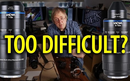
Coming to you from Keith Cooper, this practical video walks through a structured exercise for developing a more critical eye for print evaluation. Cooper uses a test image and prints it twice on the same Epson ET-8550 using two different media settings and profiles. The two profiles he compares are the VFA media setting and the Epson matte media setting, both applied to a double-sided matte paper from MediaRange. The differences between them are subtle, which is exactly the point.
The test image itself is designed to be difficult. It includes heavily saturated artificial and natural colors, shadow detail, skin tones, darker tones, sunset gradations, and more. Cooper recommends printing it at A3 or larger so the individual features are easier to examine. A hand lens helps, and so does a consistent light source. He uses an Ilfolux lamp with variable color temperature, and he also mentions a light meter, specifically the S8608, at around $15, for anyone who wants to get more precise about their viewing conditions. Once you've made both prints and gone through the comparison, he recommends doing it again the next day with fresh eyes to see if your assessment changes.
Where the exercise gets genuinely interesting is in the next stage Cooper describes: separating the prints into different rooms. When two prints sit side by side, differences in shadow detail, color gradation, and tonal richness are relatively easy to spot. Move them 6 ft apart and that gets harder. Put them in separate rooms and you start to realize that a print's overall impression differs significantly from its measurable technical quality. A matte print next to a gloss print can look flat and lacking, but that same matte print viewed on its own can look excellent, depending on the image. Cooper makes the point directly: most viewers don't see the fine technical details at all, and learning to see them yourself is a skill you have to build deliberately through repetition and structured comparison. He also notes that the download page for the test image includes a detailed written description of every feature in it, which is worth reading before you start.
Check out the video above for the full breakdown from Cooper, including his notes on which profile produced better results on this specific paper and why.
What's Your Reaction?
 Like
0
Like
0
 Dislike
0
Dislike
0
 Love
0
Love
0
 Funny
0
Funny
0
 Wow
0
Wow
0
 Sad
0
Sad
0
 Angry
0
Angry
0









Comments (0)