How to Edit Portrait Skin Tones in Lightroom
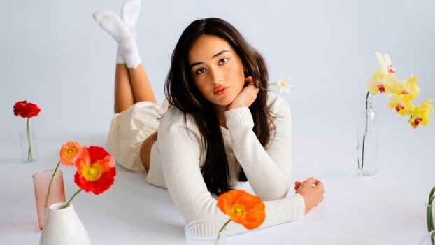
Lightroom skin tone editing is one of those things that separates a gallery that looks cohesive from one that looks like a collection of individual images. Get it wrong and even technically sharp, well-exposed portraits look off in ways clients can't always name but will absolutely feel.
Coming to you from Gerard Needham, this practical video walks through the five-step process Needham uses to achieve the clean, consistent portrait look that's been drawing attention on his recent client work. He starts with white balance syncing across lighting conditions, which sounds basic but makes an enormous difference when you're delivering a gallery shot across a full day. From there, he gets into tone and contrast manipulation, and this is where the approach gets interesting: rather than one universal method, Needham lays out two distinct foundations, a softer, matte film look built on pulled highlights and lifted blacks, and a more recent editorial approach that pushes whites up and uses the contrast slider strategically to expand the midtone range. Both share the same underlying logic, but the results look meaningfully different.
The skin color section is where a lot of people go wrong. Adobe Color, while a solid base profile for its cross-camera consistency, produces a greenish-orange cast on skin that he describes as an Oompa Loompa tone. His fix lives in the HSL panel, nudging the red and orange hue sliders toward a more red-pink and pulling back orange saturation slightly. He also covers the point color tool, which he was initially excited about, and gives an honest assessment of why it doesn't actually offer much beyond what the orange hue slider already does for portrait skin.
Needham's workflow doesn't stop at color. He covers cropping decisions, including aspect ratio syncing across a gallery and how he thinks about composition fixes in post when a shot wasn't framed ideally on location. The masking section is particularly useful if you shoot on vintage glass. He uses a Canon 100mm lens that's about 30 years old, and the washed-out background it produces gets addressed with background-select masking, exposure and clarity adjustments, and a radial gradient subtracted from the background to push light specifically onto the subject. The color separation he creates between the warm skin tones and a cooled background is a simple technique that adds real depth to the final image.
Check out the video above for the full rundown from Needham, including the masking workflow and the final before-and-after on the full gallery.
What's Your Reaction?
 Like
0
Like
0
 Dislike
0
Dislike
0
 Love
0
Love
0
 Funny
0
Funny
0
 Wow
0
Wow
0
 Sad
0
Sad
0
 Angry
0
Angry
0


Comments (0)