

The Zelda: Ocarina of Time Remake's Art Style Has Completely Divided Fans. Everyone Is Right

Published Sep 8, 2026, 4:04 PM EDT
Both the fans and detractors have fair points
 Image: Nintendo
Sign in to your Polygon.com account
Remaking a game as iconic as The Legend of Zelda: Ocarina of Time is a daunting task. The more beloved a game is, the more it's bound to have a wider audience that is very protective over every aspect of it. Even when the project was first announced in June with a crumb of a teaser trailer, fans spent months debating the remake’s art style based off of a single shot of Link. It was only a matter of time until the simmering pot boiled over.
That’s exactly what happened following Nintendo’s Zelda 40th Anniversary Direct on Tuesday. The showcase gave us a much deeper look at Ocarina of Time, revealing a fairly faithful remake down to the presence of loading screens. It also put that one teaser trailer shot in a much wider visual context. We now know the exact look the remake is going for, finding a balance between modern realism and fairy tale whimsy. Just as was the case with Nintendo’s Star Fox remake earlier this year, fans are divided on the look; it’s a true love-it-or-really-hate-it situation.
I can understand why it's eliciting such polar opposite reactions. For every stunning moment we saw in the new trailer for the Ocarina of Time remake, we also got some uncanny glimpses that bordered on creepy. There’s a clash of styles happening in Ocarina of Time’s trailers that begs for a nuanced breakdown of what’s working and what’s not at a glance. And none of that is new for a series whose art has been under the microscope several times across its 40-year history.
It’s easy to see both sides of the coin when watching Tuesday’s trailer. Ocarina of Time is a significant visual departure from its Nintendo 64 predecessor, because of course it is. Generations of technological advancement meant there was no world where a Switch 2 remake would have the same polygonal texture that defined the original. That’s swapped for a modern look filled with more grounded colors, realistic lighting, and a modern sheen that brings it in line with its modern peers.
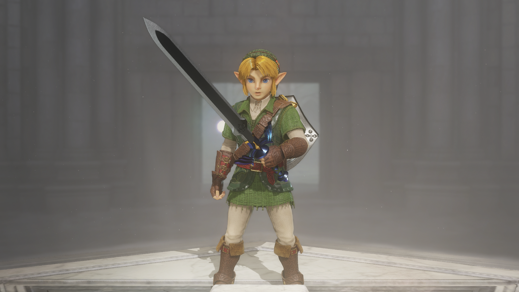 Image: Nintendo
The detractors were quick to jump on it moments into the Direct. No more than 90 seconds into the gameplay presentation, I saw multiple posts across social media making the same joke: “Nintendo hired this man.” It was if prolific posters had it in the can and were ready to fire it off with the first screenshot they could snap. The gag references a meme about fans who claim to “fix” classic games by posting screenshots and videos of modernized visual touch-ups. (The most infamous example came from a laughably “yassified” take on Horizon Zero Dawn’s Aloy, which is where “hire fans” originated from.)
It’s not an unearned joke. At first glance, Ocarina of Time does feel like it’s been given an Unreal Engine 5 treatment that puts realism at the forefront. Take its color palette, for instance. The original game is flush with rich colors that help emphasize all the different elements and dungeon themes at play. Based on what we’ve seen so far, the remake is going in a more muted direction. There’s a big focus on earthy tones that make everything look a little more realistic, but give it a less distinct sense of personality all around. There are even a few dark shots in the trailer that make it hard to make out much at all under the heavy shadows. It’s not absurd that someone would prefer the original’s look more considering how much something like Link’s red Goron Tunic pops on screen.
 Image: Nintendo
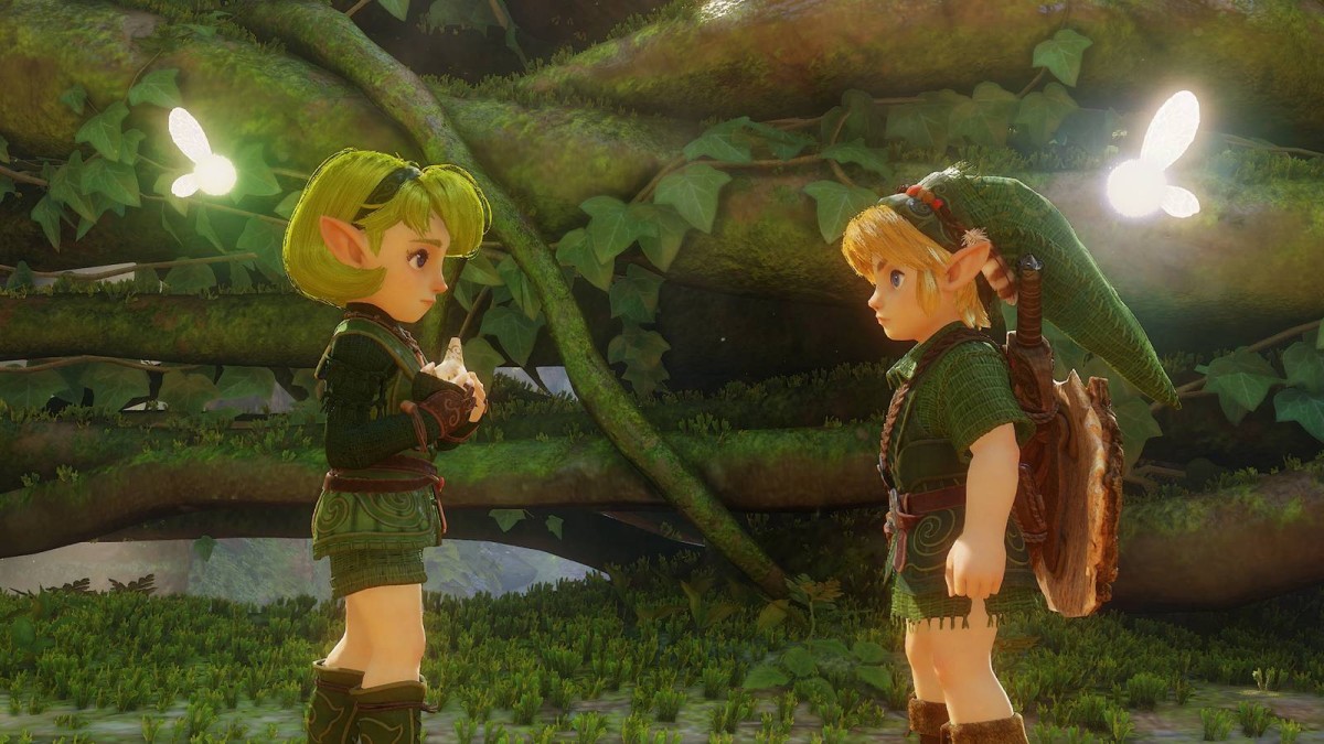
I’d be hard-pressed to say that the look is devoid of style, though. There’s a lot to be impressed by in what we’ve seen so far. The environmental work, for instance, is astonishing. Kokiri Forest is bathed in streaks of light poking through the trees, making it feel like a hidden town buried in the woods. It now feels like a location born out of a fairy tale. There’s similar whimsy to be found in the bustling streets of Hyrule Castle Town, the dreamy blue hues of Lake Hylia, and a looming Death Mountain that looks like it was pulled from The Lord of the Rings. There’s a good argument to be made that the new look is a logical escalation of the original game’s art, ratcheting up a traditional fantasy look that’s very different from any other Zelda game since.
What’s a little harder to fully get a handle on are the character models. Young Link looks especially creepy with his plasticine skin and shiny hair. The same goes for Zelda and Princess Ruto, who look like a pair of Amiibo come to life. I can get behind the direction, at least on a conceptual level. The characters have a doll-like quality to them, which further plays up the whimsy factor of it all. Maybe we’re to see ourselves as kids watching a puppet show — and those puppet shows are a little creepy sometimes! It’s on a similar wavelength as Nintendo’s excellent Link’s Awakening remake, which leaned into a toy aesthetic to emphasize the original game’s playful quality.
 Free sign-up
Get Polygon’s Wishlister newsletter
A weekly cheat sheet to what you’ll eventually love to play. No buying, no commitment — just saving for later.
Sign up freeFree. Unsubscribe anytime.
If there’s anything that strikes me as off-putting about the characters, it’s that I’m not yet sure if they fit into the gorgeous world they’ve been placed in. It’s a little odd to see Link’s highly detailed clothing, where you can see every single stitch, against his exaggerated eyes. Ganondorf is a little unsettling too; in one dark shot, he holds his hand out to show off shiny, smooth fingers that look a bit jarring next to the hyper-detailed textures elsewhere. It takes me back to Super Smash Bros. Brawl, where Mario was placed into realistic denim that clashed with his toon face.
For all of those reasons, and plenty more, I can understand both sides of the heated debate. There’s a bit of a hodgepodge style happening here that’s trying to find a middle ground between the original game, something grounded in realism, and a fantasy storybook. I’m not willing to make any firm judgments before playing it, because it’s clear that some extra context is needed to see how it all snaps together in the big picture.
And that’s a feeling that Zelda fans should know by heart after 40 years of discourse. Zelda’s evolving art style is practically a feature for any new game at this point, as Nintendo loves to get experimental with each game. That’s fueled plenty of discourse over the years. While Wind Waker’s toon art is beloved today, it was a flat out controversy in the early 2000s, as fans were shocked that the series was abandoning realism for cel-shading. Developer Grezzo’s Link’s Awakening remake similarly ruffled some feathers thanks to its chibi style. Heck, even Breath of the Wild’s art style was initially a point of contention for following the grittier vibes of Twilight Princess.
Not for nothing: All of those games overcame initial skepticism once players actually got to go hands on with them and experience first-hand how those art styles fit their respective games.
I expect that the same will be true for the Ocarina of Time remake, though it may wind up being the series’ most polarizing visual moment since Wind Waker. If the art can emphasize the story’s timeless folktale quality and transport players to a weird kingdom that’s both familiar and otherworldly, there’s good historical reason to believe fans will come around to the look in the long run. We won’t really know how successful it is until the next mainline Zelda game is announced. If that one is met with complaints that it doesn’t look like Ocarina of Time, you’ll know Nintendo won in the end once again.
What's Your Reaction?
 Like
0
Like
0
 Dislike
0
Dislike
0
 Love
0
Love
0
 Funny
0
Funny
0
 Wow
0
Wow
0
 Sad
0
Sad
0
 Angry
0
Angry
0






Comments (0)