

The ColorChecker, a Photographer’s Best and Most Colorful Friend, Turns 50 Years Old
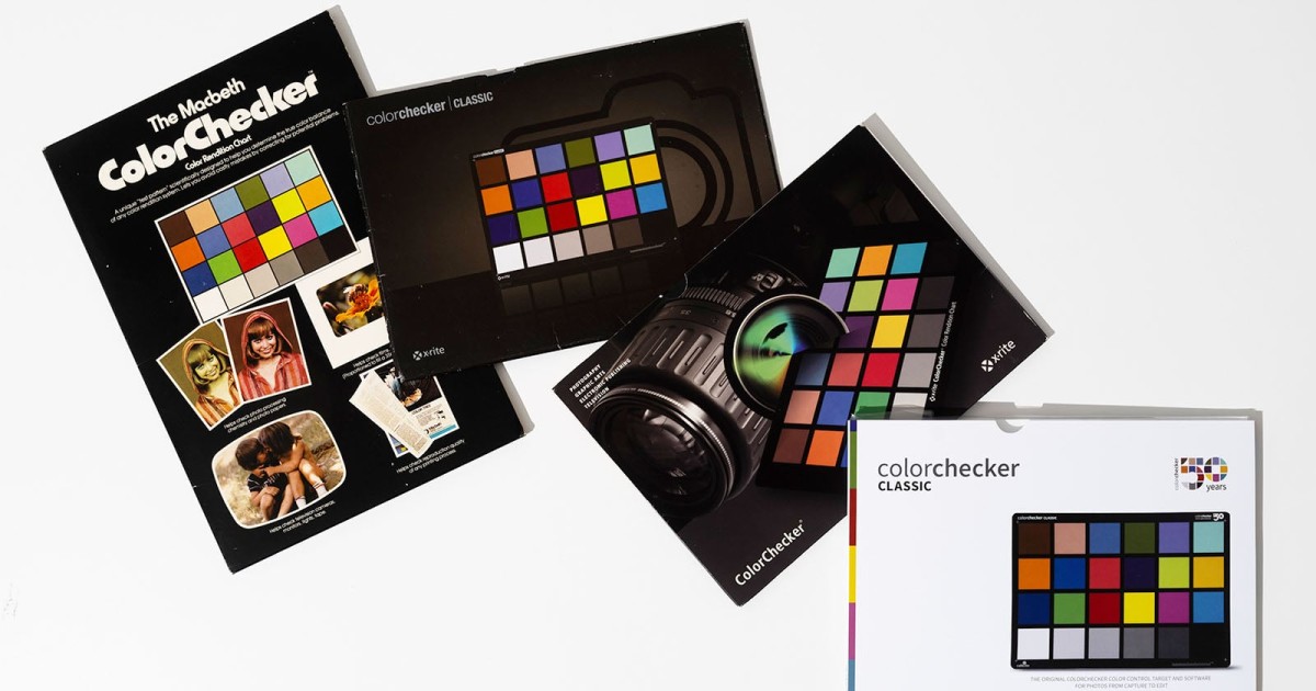
For 50 years, the Calibrite ColorChecker has been helping photographers worldwide accurately capture color. The ColorChecker’s 24 squares have kept photos color-accurate, from family photos few will ever see to countless photos that have graced magazine covers, billboards, and museum walls.
Full disclosureThis article was made possible by Calibrite.
A mainstay in the studios and kits of professional photographers worldwide, the Calibrite ColorChecker has always answered one very important question: What color is this, really? No accessory has made answering this question easier than the Calibrite ColorChecker.
How Photographers Actually Use the ColorChecker
Even though editing color is certainly easier in the digital age than in the analog one in which the ColorChecker was born, thanks to the magic of RAW processing and flexible digital photo files, photographers still need an accurate, dependable baseline. The problem that the ColorChecker is built to solve hasn’t changed; it is rarely easy to know exactly what color something is under changing, unpredictable lighting conditions.
For those who have never done color-critical work, the Calibrite ColorChecker is extremely easy to use, a big part of its longstanding success, no doubt. Once a photographer has dialed in their light in the studio or on location, or found the perfect natural light for their shot, they open up the ultra-thin ColorChecker, put it in the frame, and fire away.

This initial grounding shot provides the color swatches and grayscale grids a photographer, editor, or colorist needs to consistently dial in accurate color time and again.
“I have a ColorChecker Passport in every camera bag,” says photographer Katrin Eismann. “Reducing technical anxiety and doubt with a color-managed workflow allows me to concentrate on creativity.”
The Birth of the ‘Color-Rendition Chart’ in 1976
Back in the summer of 1976, three scientists at Macbeth, then part of Kollmorgen, wrote a paper called “A Color-Rendition Chart.” In it, lead author Dr. Calvin McCamy described a known truth inside a frame. McCamy worked alongside H. Marcus and J. G. Davidson.
Arguably the most important development is that each patch was designed to shift under changing light conditions, the way that objects in the real world do, including skin tones. It was a colorful body double that “fooled” film the same way that reality does. The original chart was 13 by 9 inches and had similar proportions to a 35mm film frame.
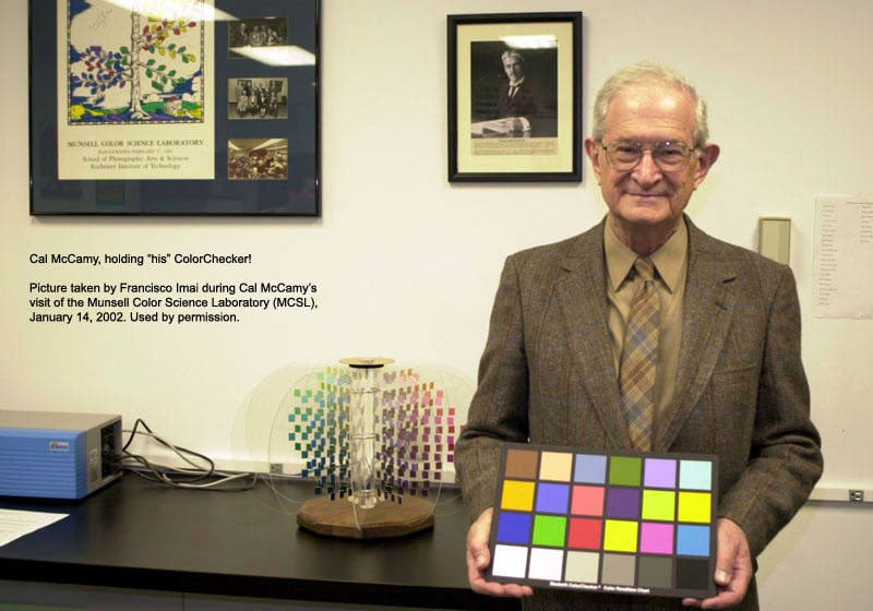 Dr. Cal McCamy with his ‘Color-Rendition Chart’
“Photography, color printing, and television do not truly reproduce all colors. The nature of the rendition may be described in terms of the ways in which the colors in the image differ from those of the object,” McCamy et al wrote in 1976. “The image and object may be compared visually or by measurements. To facilitate comparisons of this kind, we have developed and are making available a well-characterized color chart to be used as a standard test object.”
And make it they did.
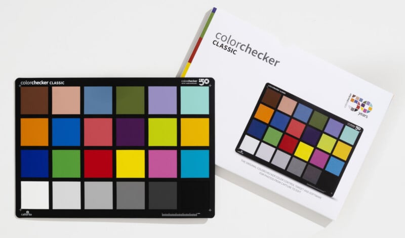
While the ColorChecker’s colorful swatches, which include a few replicated skin tones, blues, greens, purples, red, orange, and yellow, are certainly eye-catching, photographers have relied most heavily on the ColorChecker’s bottom row of shades of gray over the years.
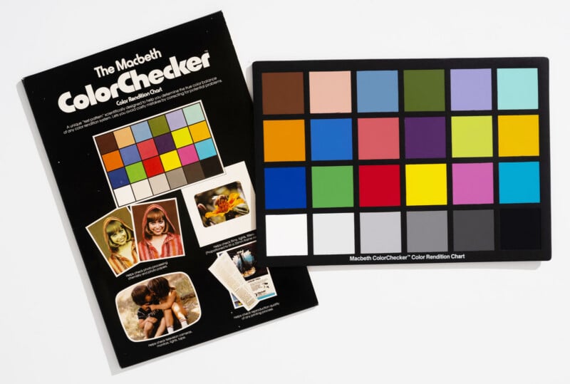 The ColorChecker in 1977
Back in 1976, long before digital photography was a realistic dream, Dr. McCamy, Marcus, and Davidson believed that their chart would be “frequently used” to test different kinds of films, including measuring how their spectral responses changed with age. They also believed photographers would use their color chart to analyze lenses, lighting conditions, studio wall colors, and the effect of exposure time on color.
They also had the wisdom to recognize that while photographers may want to use their color chart to get a useful ground truth, the final color rendition in a photo should ultimately be judged by people themselves.
“The chart is a useful analytical tool, but final judgements should always be based on actual use of processes,” McCamy et al wrote. “After all, the ultimate objective is satisfactory results.”
 Credit: Marianna Santoni
Delivering Results for 50 Years
For 50 years, the Calibrite ColorChecker has helped photographers achieve the desired color and exposure results. Over that time, the ColorChecker has come in many forms and is currently available in five sizes.
The teeny-tiny Nano is built for macro work and is barely bigger than a postage stamp, which is remarkable. The Mini easily fits into a photographer’s pocket. The XL is, as its name suggests, big. But the Mega? That’s even bigger, measuring roughly 1 x 1.5 meters. You can read it across a field or from the air with a drone.
“The science never changes, only the scale,” Calibrite says.
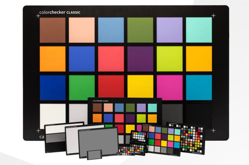
ColorCheckers even go far beyond the 24-square grid of the classic. The Digital SG has 140 swatches. It includes the original 24 colors, a 17-step grayscale for even finer tonal control, a 14-swatch skintone chart, and more. These 14 skin tones are a direct descendant of the original two developed in 1976.
“My clients are every shade, and getting their skin right the first time is everything,” says photographer Alan Shapiro. “With a solid reference I stop guessing and start delivering true to life, every session.”
Shapiro’s concerns go beyond getting people’s skin tone right. Sometimes he even gets to prove his mettle to a client.
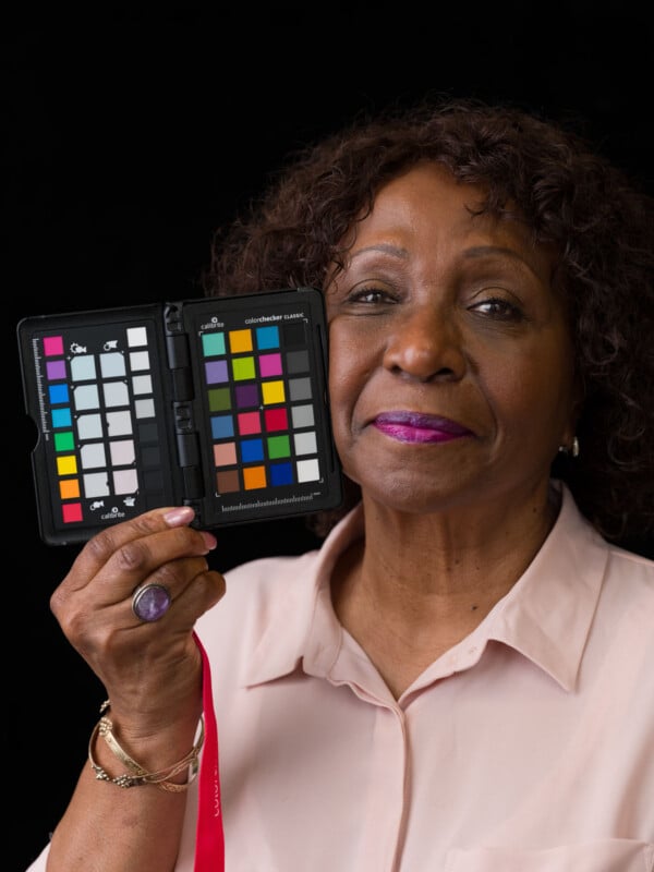 Credit: Alan Shapiro
 Credit: Alan Shapiro
 Credit: Alan Shapiro
 Credit: Alan Shapiro
“A client swore the red on their product was wrong,” Shapiro recalls. “I pulled up the frame with the cart, matched it in seconds, and the debate was over.”
While in that case, Shapiro was showing accurate color to a client, it can matter just as much, if not more, to photographers themselves. No matter what gear someone is using or where they are shooting, the ColorChecker helps them dial in consistent, accurate color.
From Science to Art
So much about photography has changed in the past 50 years, but the ColorChecker has remained remarkably consistent. Its timeless qualities are a big reason why it has become iconic. Photographers have used the ColorChecker to help perfect countless works of art, many of which hang in museums and galleries worldwide.
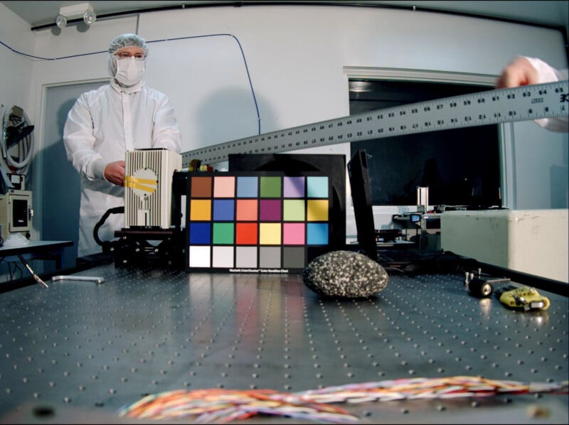 NASA testing a Mars descent imager using a ColorChecker
The ColorChecker is also extremely useful for scientific applications. For starters, it is used to test cameras and evaluate the colors of materials and lights. It has even been into space.

In 2021, the X-Rite ColorChecker Classic was brought aboard the Chinese Tianhe core module in space to ensure accurate photos and videos from the cabin. Lighting in orbit is constantly shifting, so the team used the ColorChecker to correct color casts and deliver true-to-life color to people back on Earth.
50 years after the ColorChecker was born, nearly everything about photography has changed, but photographers are still just as worried about color as before.
“What color is this, really?”
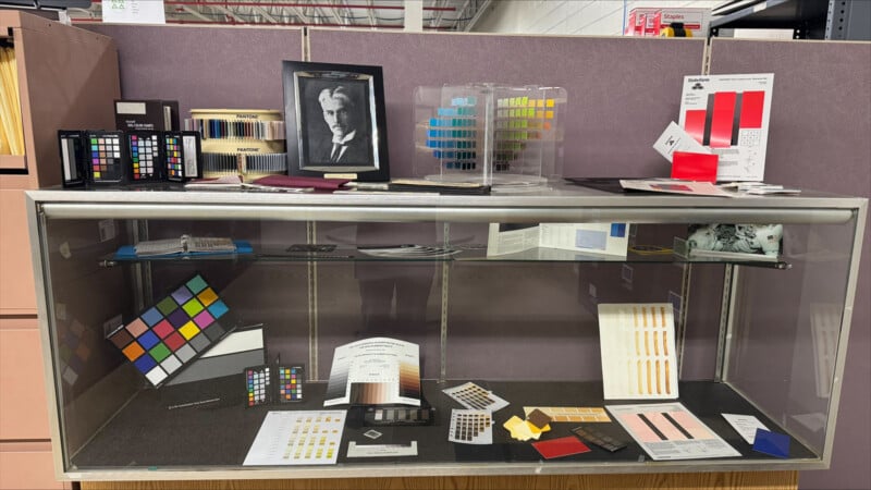
The ColorChecker answered that question in 1976. It answers it now in 2026. It will still answer it in 2076.
Full disclosureThis article was made possible by Calibrite.
Image creditsCalibrite
What's Your Reaction?
 Like
0
Like
0
 Dislike
0
Dislike
0
 Love
0
Love
0
 Funny
0
Funny
0
 Wow
0
Wow
0
 Sad
0
Sad
0
 Angry
0
Angry
0










Comments (0)