

The Lightroom Checkbox to Click Before Any Other Edit
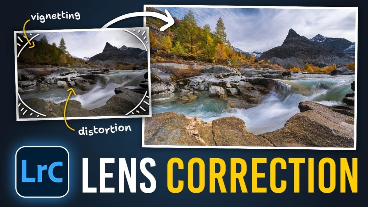
Every lens bends straight lines, darkens its corners, or leaves colored fringes along high-contrast edges to some degree, and Lightroom can correct most of that before you move a single exposure slider. If you skip that step, every adjustment afterward sits on top of a slightly warped, unevenly lit file.
Lightroom picks a lens profile by reading the EXIF data in your file. That can fail when an adapter sits between the lens and the body. Christian Möhrle of The Phlog Photography ran into this with an autumn lake scene shot on a Canon 16-35mm lens. When he enabled profile corrections, nothing changed at first. He set the brand to Canon himself, and Lightroom then guessed the wrong model, so he had to pick the correct lens from the list. Once he did, the distortion flattened out and the dark corners lifted with essentially one click. If you shoot adapted glass and assumed your profile corrections were working, open that panel on a few recent files and check what Lightroom actually selected.
Möhrle turns on the chromatic aberration checkbox for every image he edits, no exceptions. The effect can be hard to spot at normal viewing size. Zoom in on a high-contrast edge, though, and you may see a thin green line tracing the boundary, which vanishes the moment you tick the box. How much fringing you get depends heavily on the lens, so a sharp modern zoom may barely show it while older or cheaper glass can show plenty. He also treats the distortion and vignetting sliders as creative controls. He pushed distortion further than the profile required to stretch the image outward, purely because he liked the look. Then he nudged the vignetting slider up. Moving that slider right brightens the corners, and moving it left darkens them.
With the geometry sorted, Möhrle starts the edit in the Basic panel and switches the profile to Adobe Landscape for stronger color. The highlights in the scene were close to blown out, so he pulls them down hard while lifting the shadows and blacks to recover detail in the darkest areas. That flattens the image, so he adds contrast back and raises exposure slightly. He drops the temperature to cool the scene and raises vibrance. Texture, clarity, and a touch of dehaze give the image a crisper finish. The masking stage starts with a linear gradient over the left side of the frame, where a set of rocks was still too dark. Raising exposure and a little shadow detail evens out the brightness across the shot. Next, he uses a landscape mask to select the mountains, then intersects it with a brush so only the darker peak in the background is affected. On that peak, he increases contrast for a darker, moodier look and cuts saturation to tame a heavy blue cast.
The water gets its own landscape mask, with texture raised heavily and some clarity added for structure and contrast. For the autumn trees, he builds a color range mask on the yellows, widens it with the refine slider, subtracts a linear gradient to keep the foreground out, and raises exposure, then repeats those steps on the greens. An object selection drawn in rectangle mode, which he finds more accurate, picks out the foreground rocks, where he lowers saturation and nudges temperature and tint to match the rest of the frame.
In the color mixer, he leaves hue alone and raises saturation in the oranges, yellows, greens, aquas, and a little in the blues, then lifts orange, yellow, and green luminance to brighten the trees. Pulling blue luminance down darkens the sky if you want more contrast. Calibration gets a gentle drop in the blue primary hue and a boost to its saturation, and sharpening finishes the file: a lower radius, more detail, masking set while holding Alt so only the landscape gets sharpened, and then the amount.
Check out the video above for more.
What's Your Reaction?
 Like
0
 Dislike
0
 Love
0
 Funny
0
 Wow
0
 Sad
0
 Angry
0








Comments (0)