Three Images, Three Masking Strategies: Color Control in Lightroom Classic
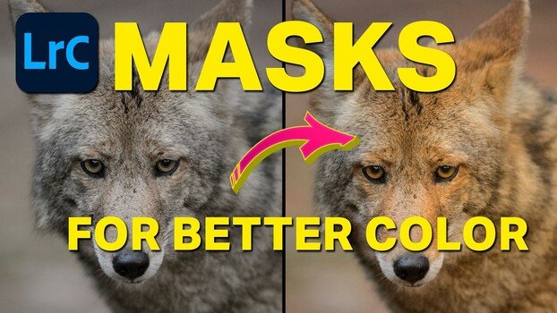
Lightroom Classic's color masking tools can target individual hues in a scene without touching anything else in the frame. If you've ever pumped up saturation only to watch every color in the image shift at once, masking by color range solves that problem directly.
Coming to you from Terry Vander Heiden, this practical video walks through three real images in Lightroom Classic and shows how masks can isolate and adjust specific colors without disturbing the rest of the image. Vander Heiden starts with a foggy fall scene from Maine, using the Dehaze slider to cut through the mist before moving into color range masks to separately warm the yellows and deepen the reds in the foliage. The key move is holding Shift to add a second color to the same mask selection, which lets you grab both a primary color and a closely related tone like maroon in the same stroke. From there, the amount slider on the mask itself becomes the fine-tuning tool, letting you dial in intensity without going back to redo the color selection.
The second image is a wildlife portrait shot on an overcast day, and Vander Heiden's approach here is worth paying attention to. He uses the white balance eyedropper on a neutral tone in the animal's muzzle, cross-checking the RGB numbers at the bottom of the screen to confirm it's truly neutral before clicking. Once the base white balance is set, he uses a radial gradient mask to add warmth to one side of the face, then duplicates and inverts that mask to cool down the opposite side. It's a simple way to fake directional light on a flat, overcast image, and the before-and-after is convincing. He also makes a point that's easy to overlook: wear neutral clothing when doing color work, since a bright shirt can reflect off your monitor and subtly skew your perception of the image.
The third image is a sanderling on the beach, and it's the most layered example in the video. Vander Heiden stacks multiple masks, including a linear gradient for the sand, an object selection for the bird itself, and a background selection that he then refines by subtracting with another linear gradient. Each mask gets its own color treatment: warmer sand, a slightly warmer and more magenta bird, and a cooler, bluer ocean background. The monochromatic starting image ends up with genuine color separation across three distinct zones. He caps it with an inverted radial gradient vignette that darkens the edges and pulls saturation slightly, which draws the eye toward the subject without an obvious dark border. Seeing how Vander Heiden makes decisions in real time, especially when a selection doesn't work and he deletes it and tries a different approach, is where a lot of the practical value comes from. Check out the video above for the full rundown from Vander Heiden.
What's Your Reaction?
 Like
0
Like
0
 Dislike
0
Dislike
0
 Love
0
Love
0
 Funny
0
Funny
0
 Wow
0
Wow
0
 Sad
0
Sad
0
 Angry
0
Angry
0


Comments (0)